bloodysticktape
noun
/'blədē•stik•tāp/
1. Taped marching snare sticks, held in the left hand during traditional grip, that has accumulated blood due to a popped blister on the ring finger.
2. A graphic designer, percussionist, and goofball who creates art on the internet.
Hi! I'm Bee!
Welcome to the wonderful world of bloodysticktape. I'm a graphic designer, artist, and percussionist. I can be found working on school work with the lizards, teaching the young percussionists of the valley, or marching along with the pack.
Have questions? Want to chat? Need a drumline show or props? I'm your gal!

PORTFOLIO
A sample of some of my favorite works that I've done for myself, for clients, or for school.Please contact me if you'd like more samples of specific work.

Art Work

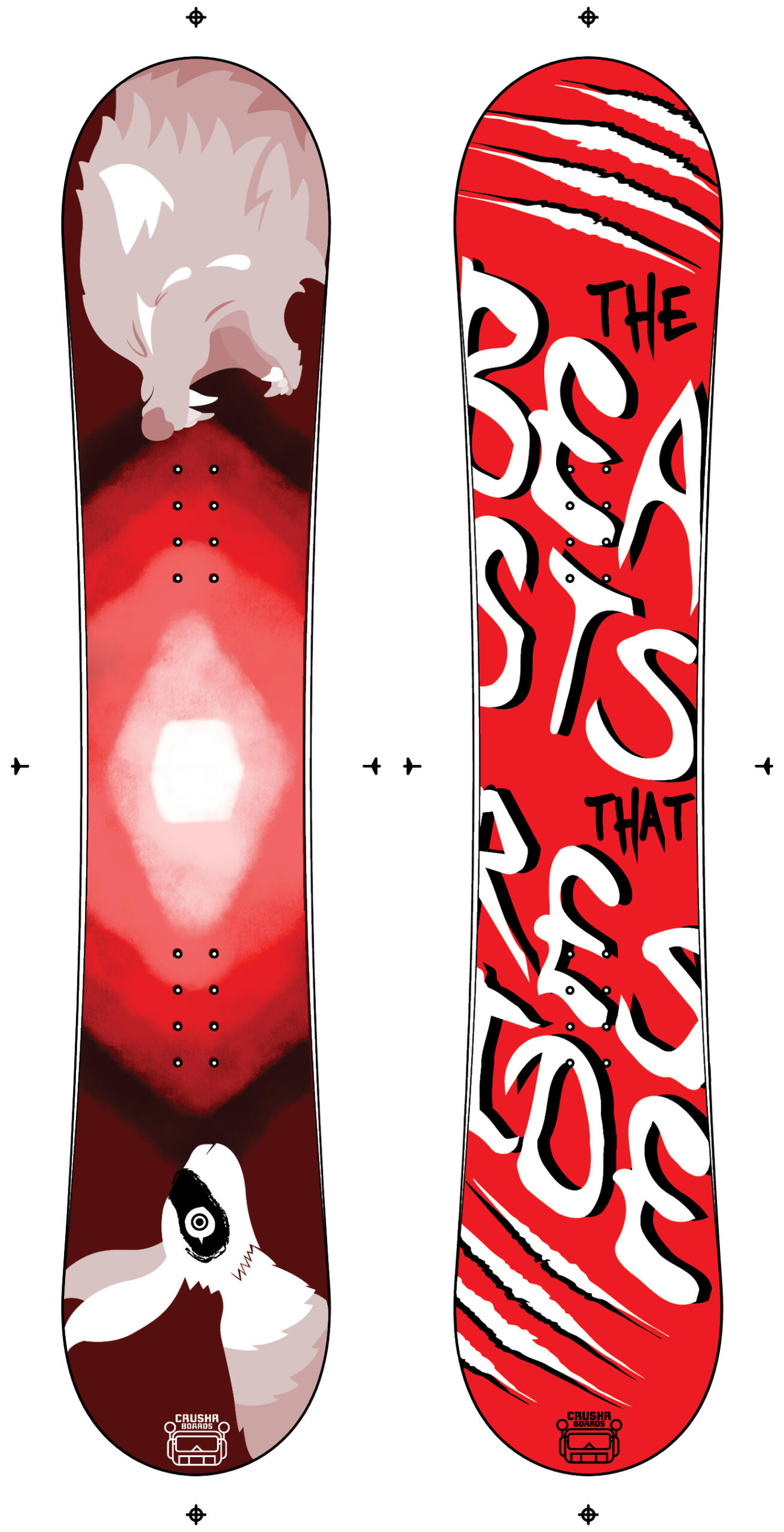
Graphic Deisgn

Motion Graphics & Edits

Percussion Composition

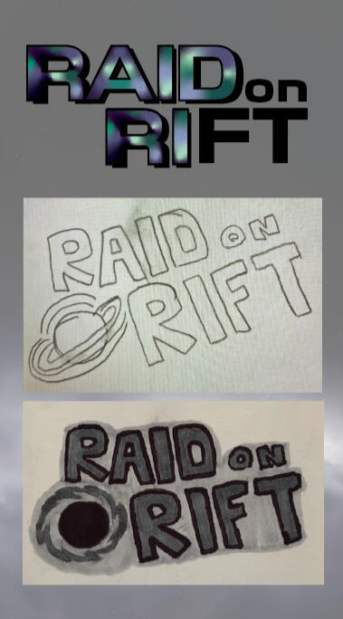
Raid on Rift


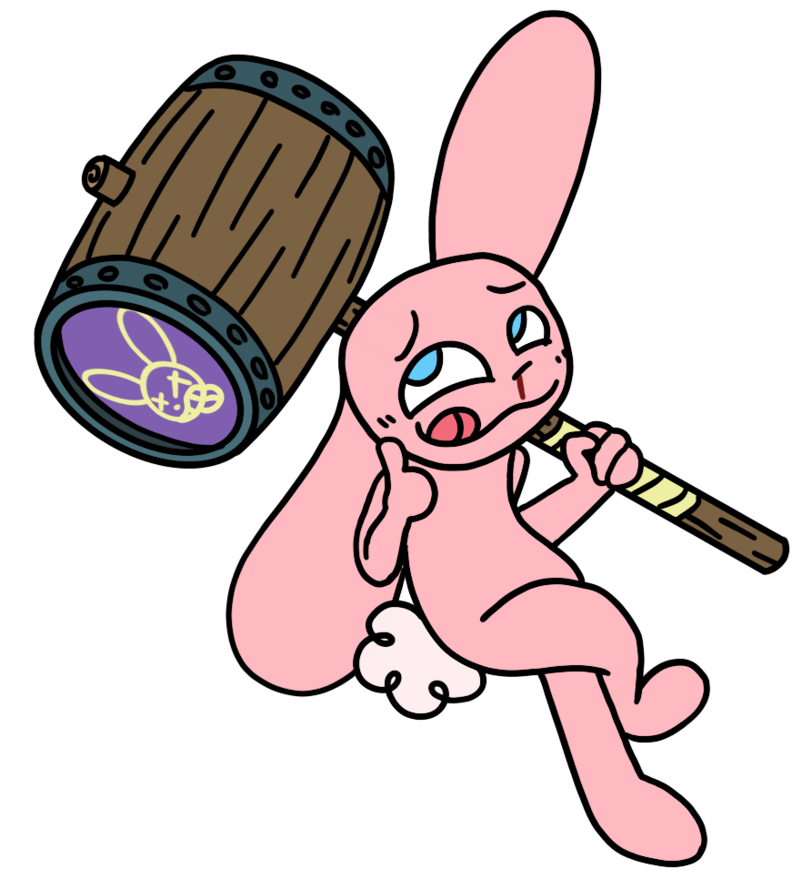
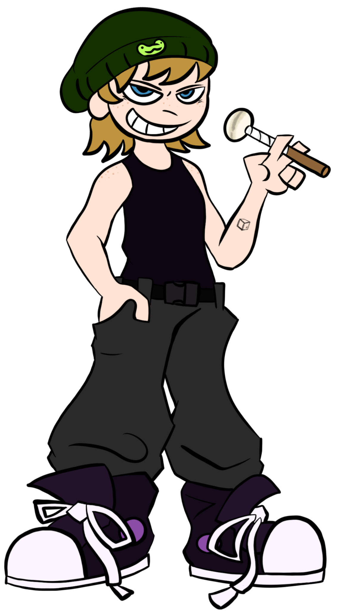
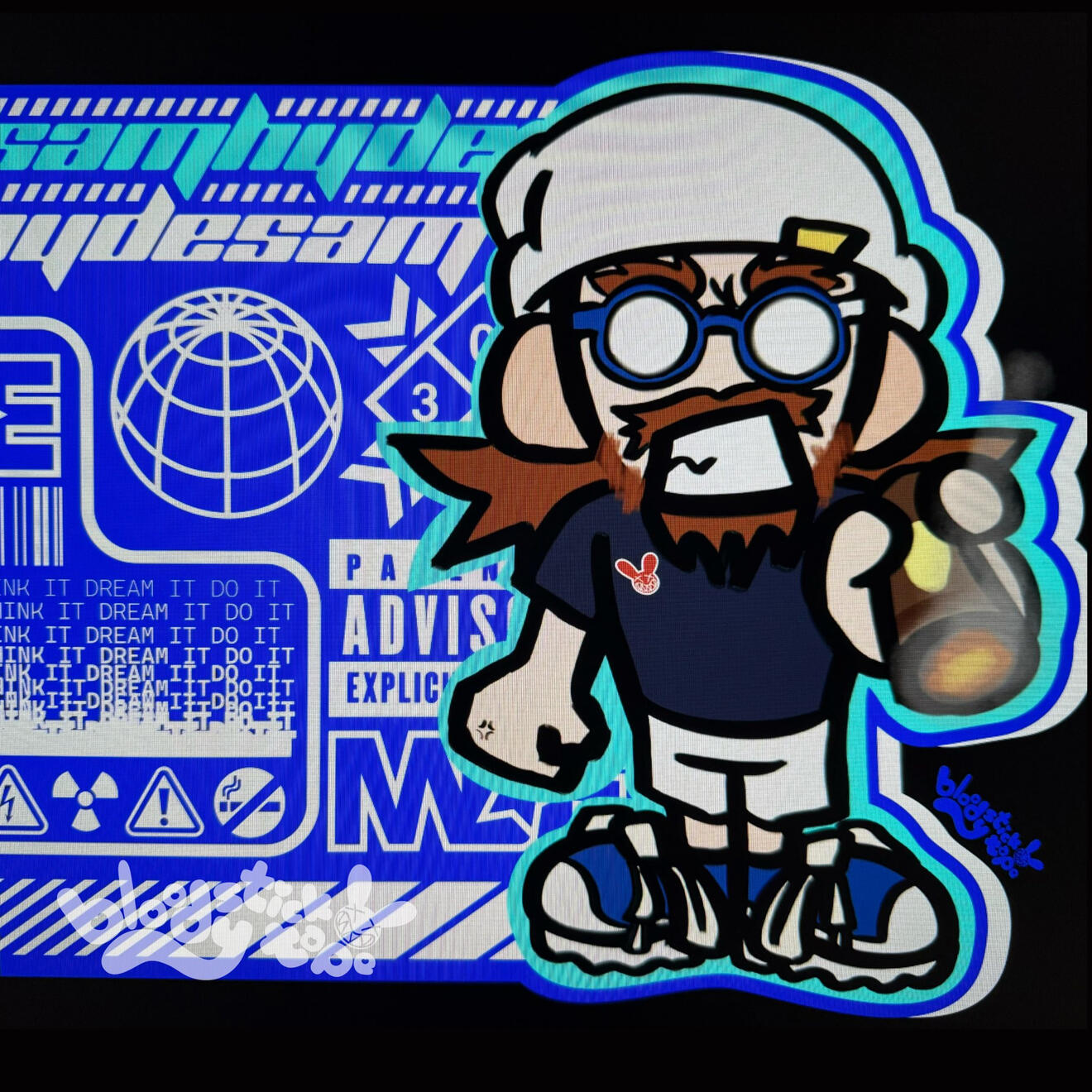
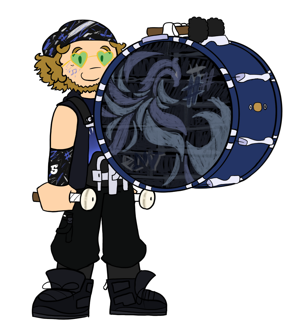
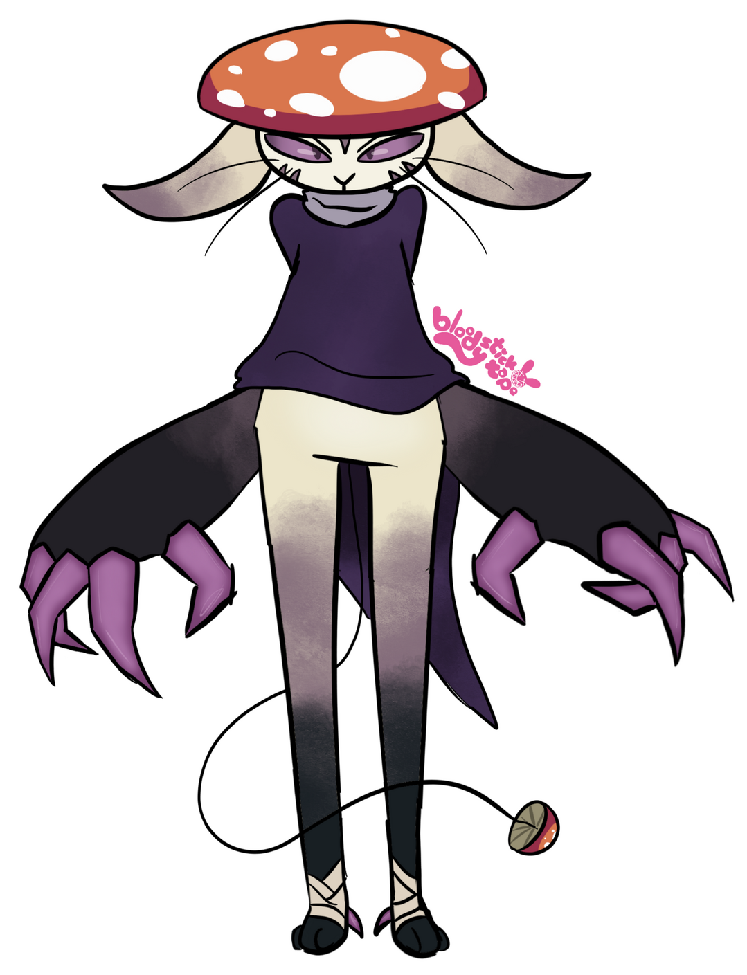
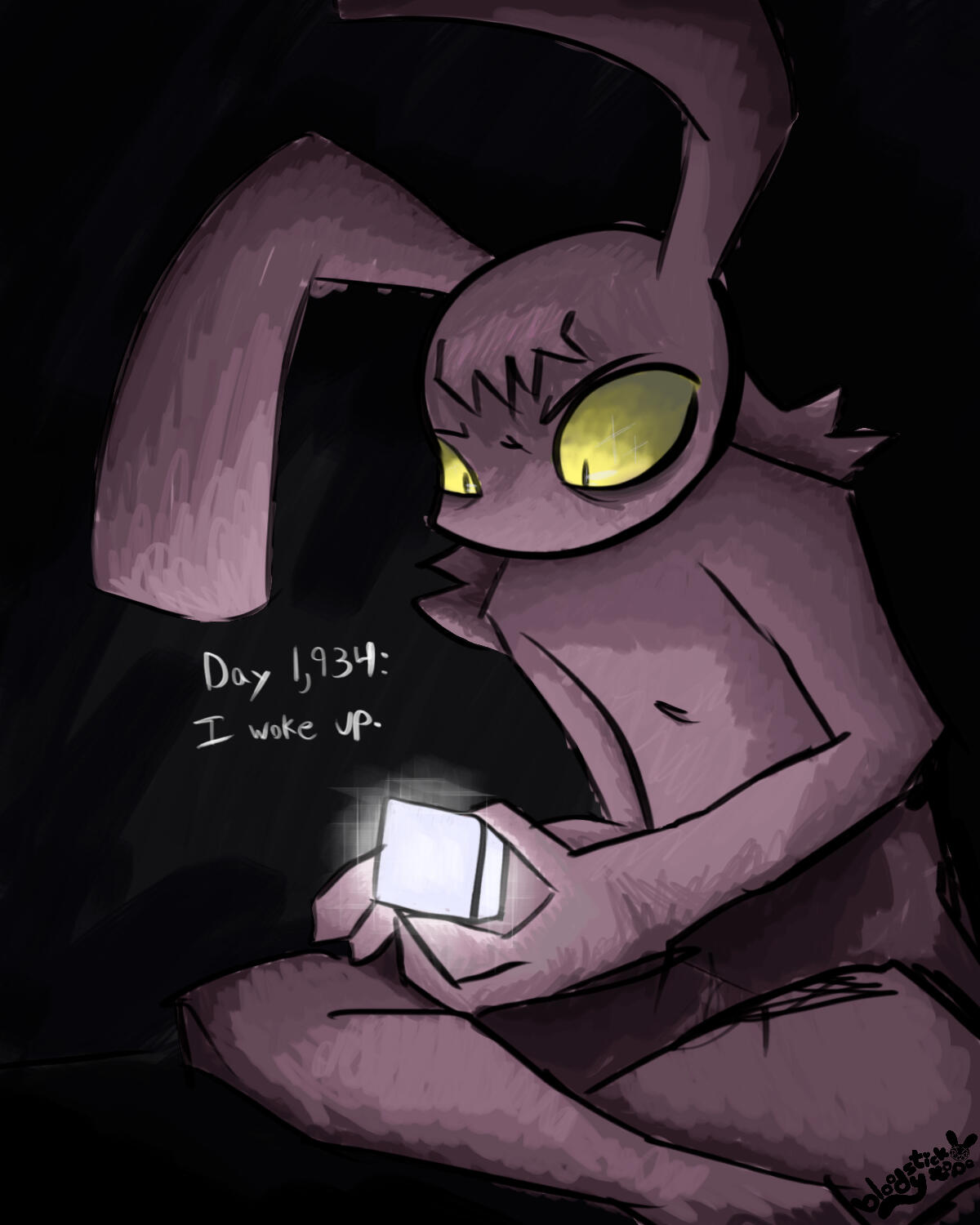
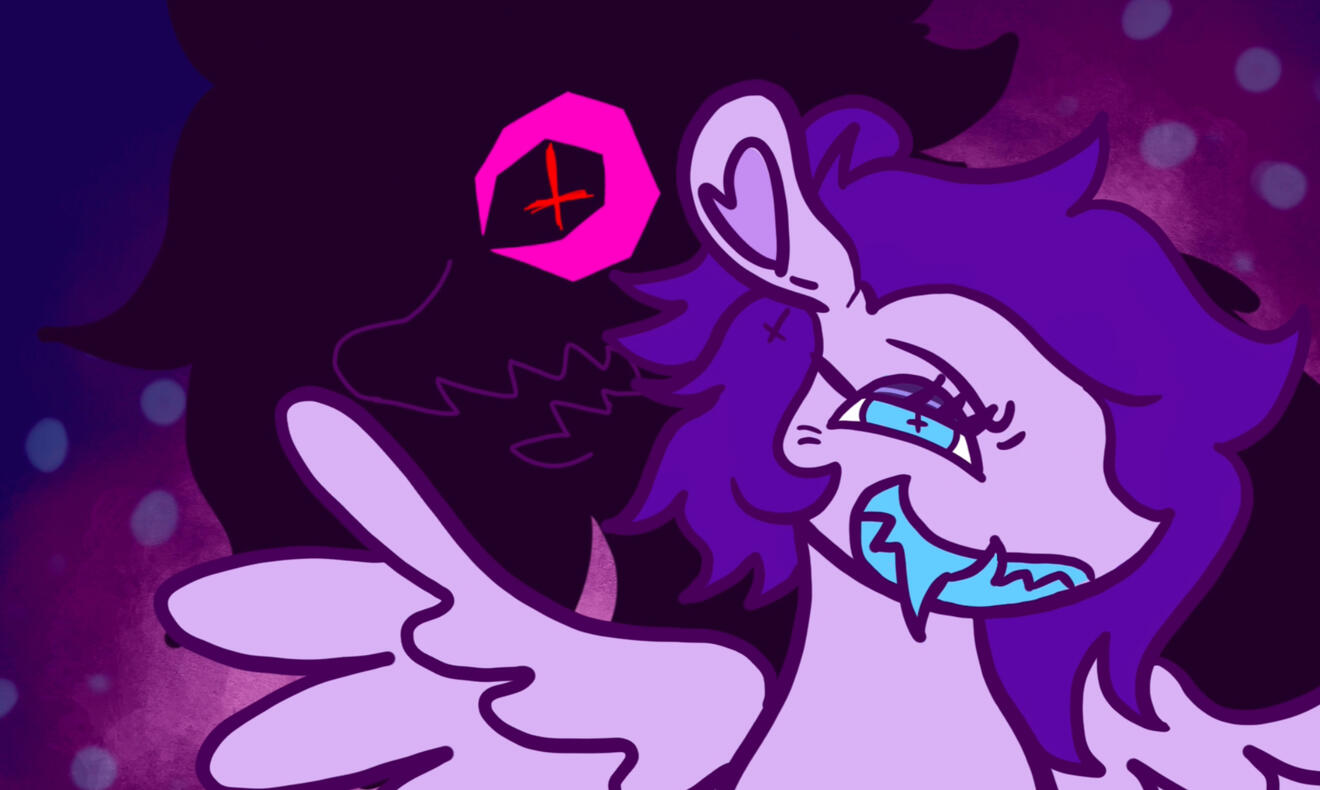
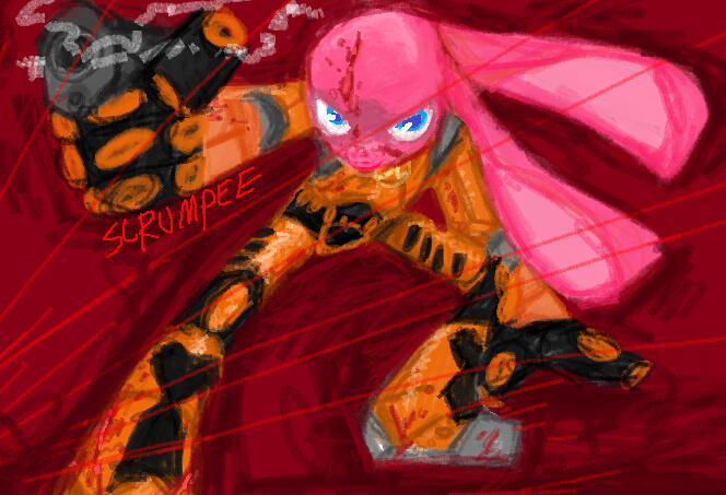
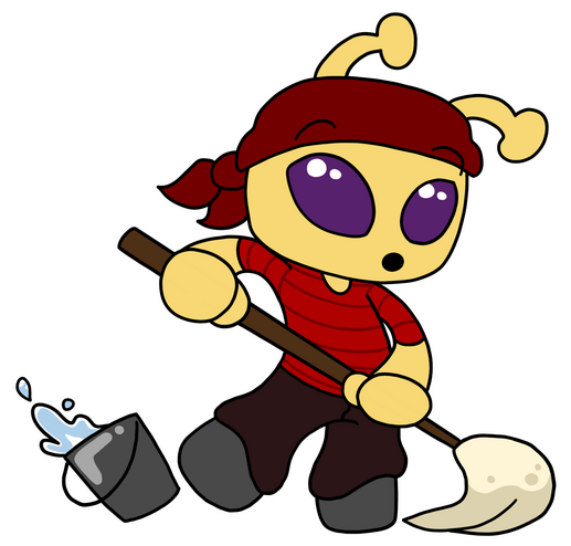
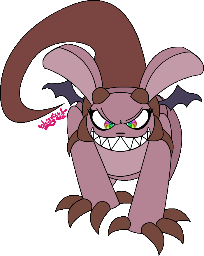
Recent Art
(more work avaliable on my Twitter and Instagram)

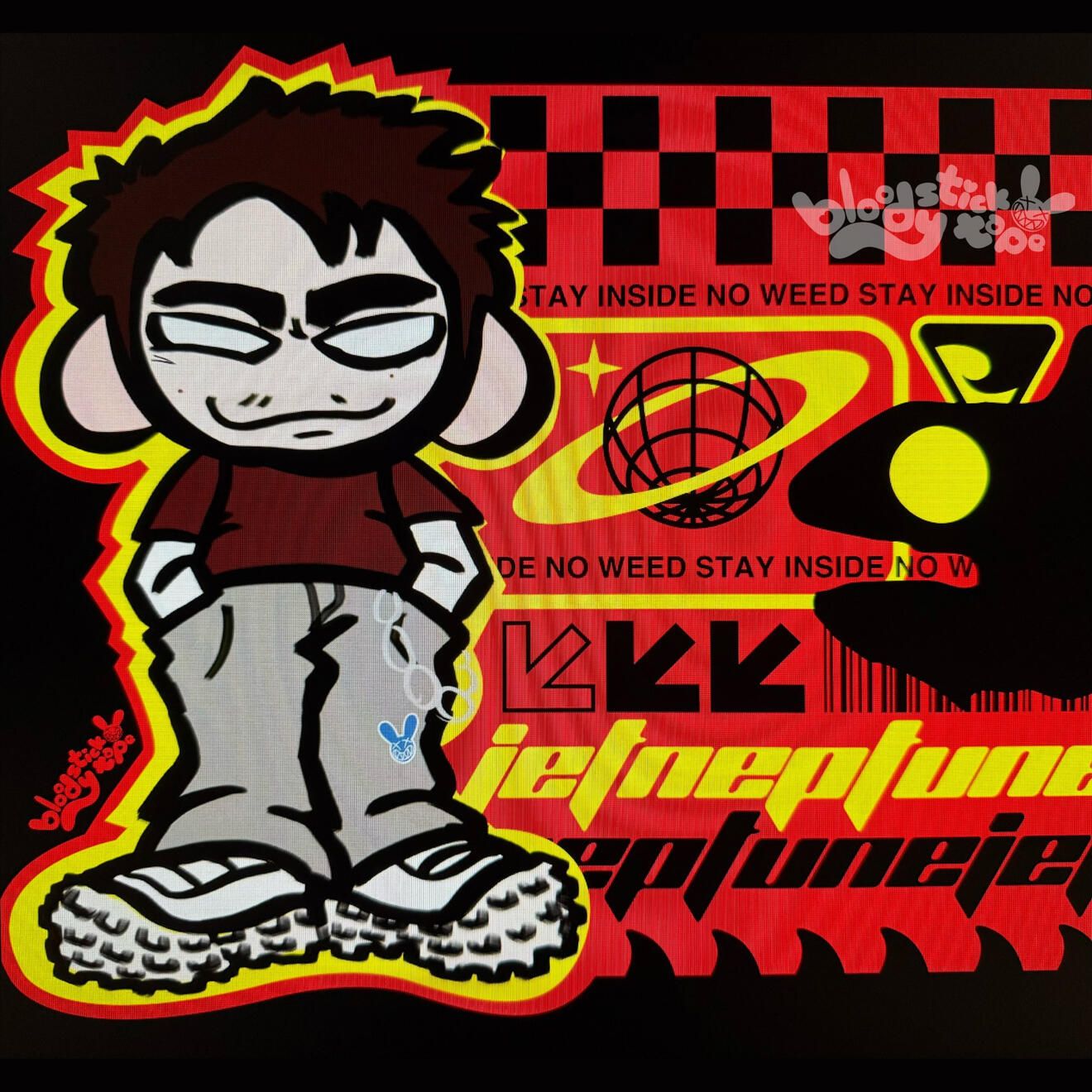


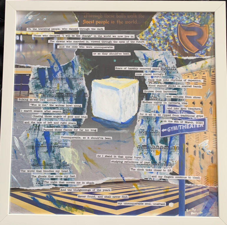

Recent Graphic Design


Photography by Jeff Shoemaker

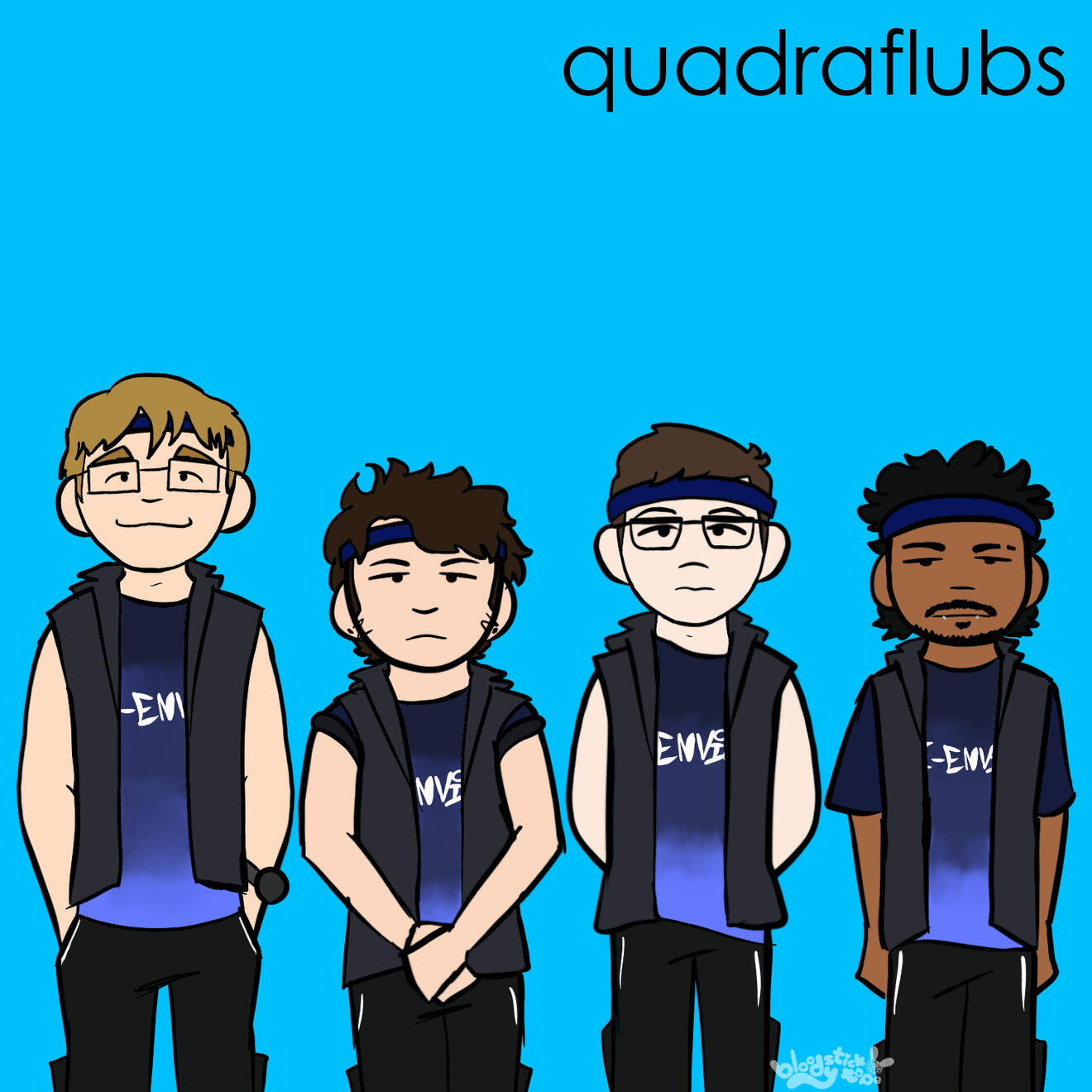
Recent Motion Graphics & Edits
Creekflow...
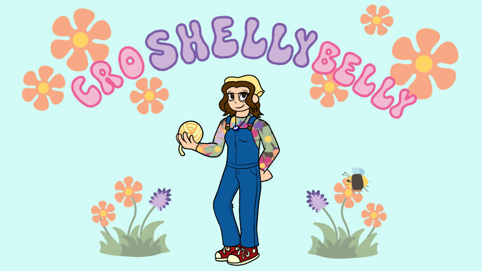
CroShellyBelly Animated Intro
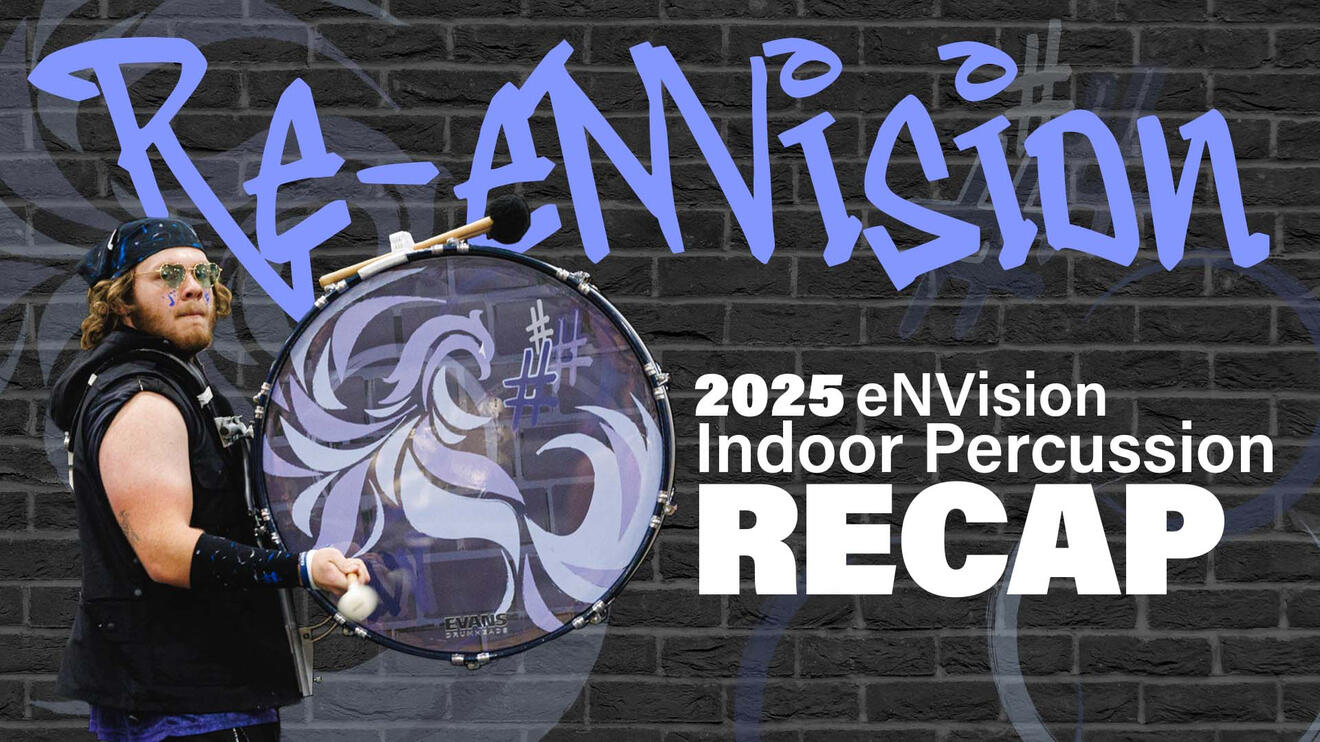
eNVision 2025 Season Recap
OC Edit

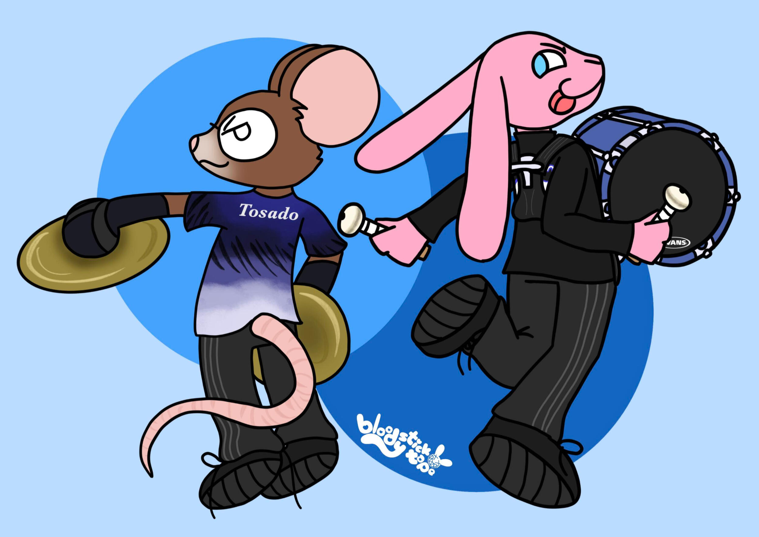
Percussion Composition Work
Peter and the Wolf Pack

Photography by Jeff Shoemaker

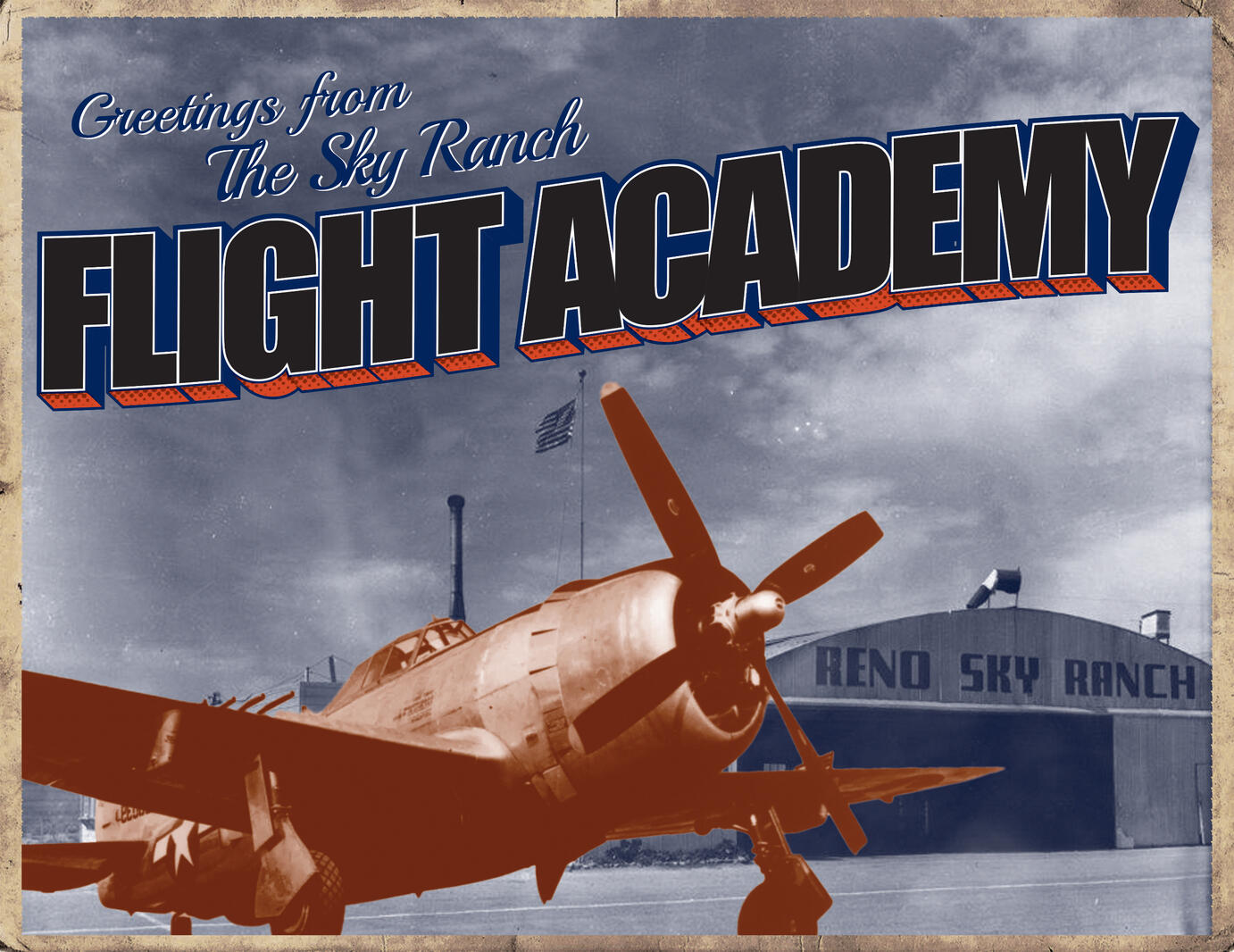
Sky Ranch Flight Academy
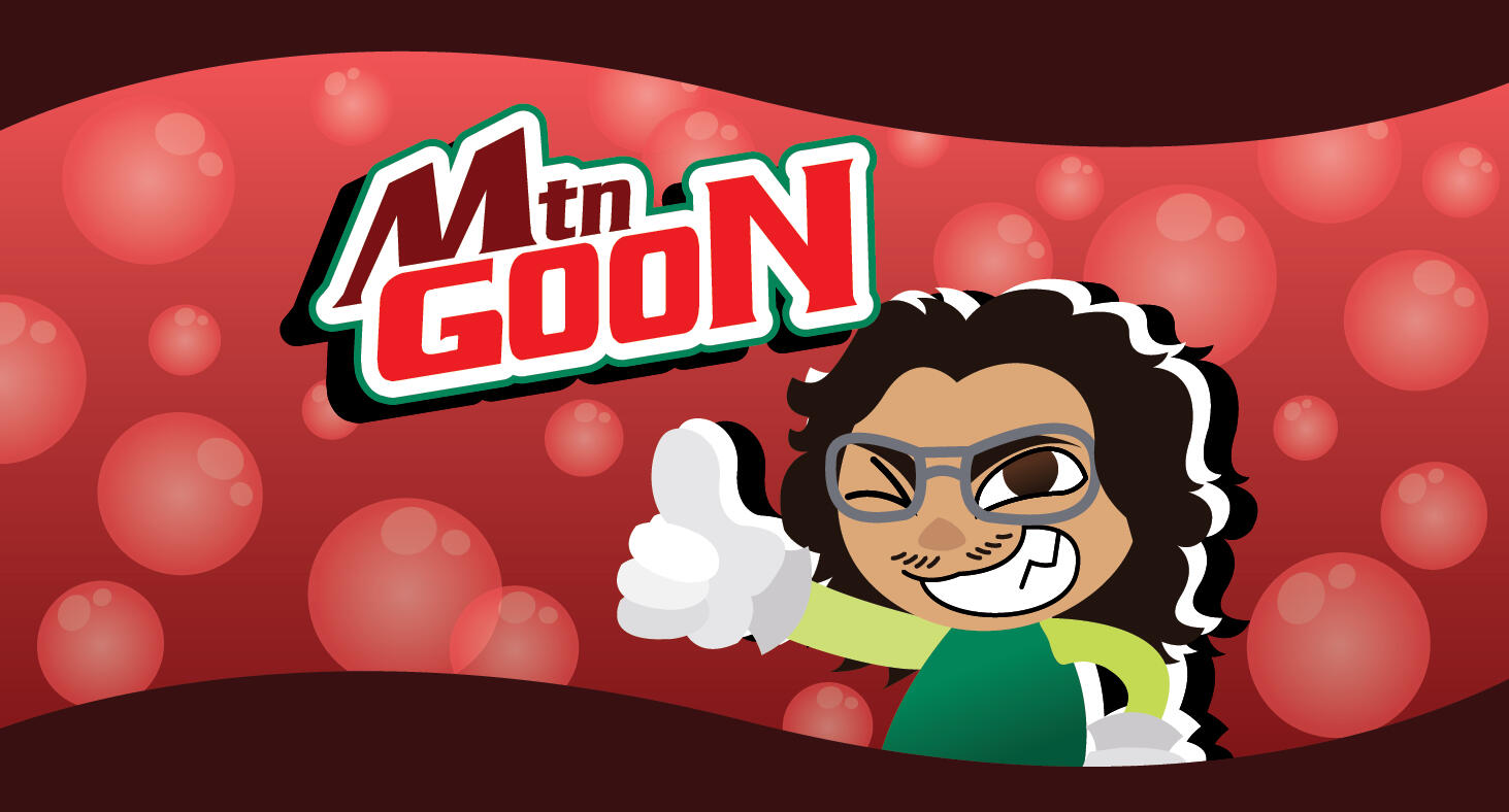
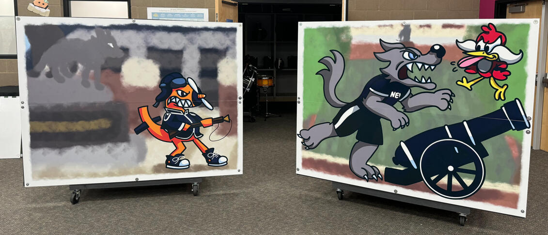
Old McDonald had a Drumline


PROBLEM
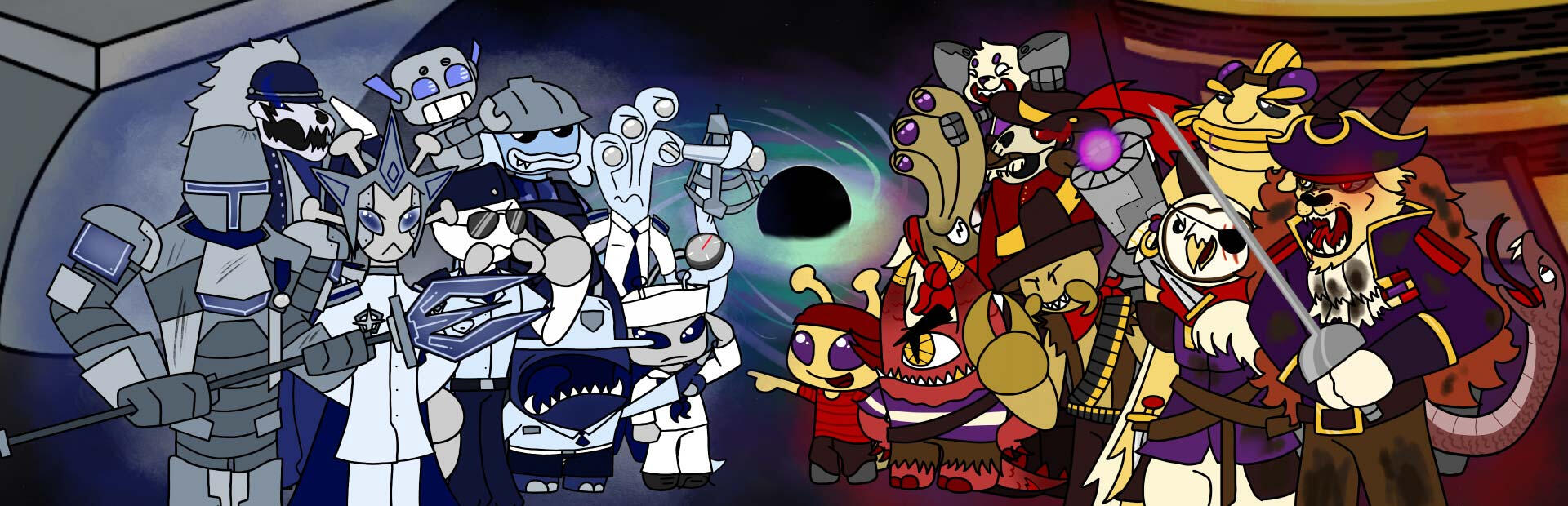
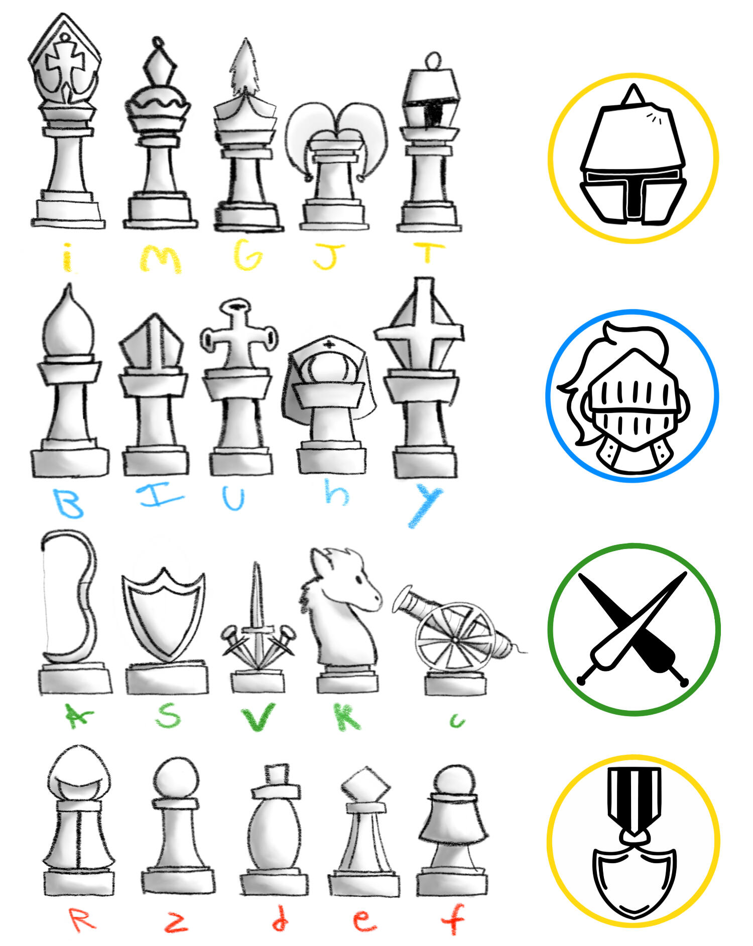
In the Spring of 2023, I was asked by my center snare of the University marching band if I wanted to be his graphic designer for his Senior Thesis. This project would evolve into 'Raid on Rift,' a turn-based strategy game with customizable teams compiled of wacky little critters. I was tasked with creating all in-game art and collaborating with the creative directors to design the sprites for the characters.The first concepts, lovingly named "Chess Two," would follow the aesthetics of a real chess set. We would use existing chess pieces and create new ones. It was essentially a Chess expansion pack.This would not be a viable solution for a senior thesis, so we started to stray away from the chess aesthetic. Queue the tokens, which end up in the final game. These are designed to be super simple, line-art styled tokens. We we're still sticking with the medieval look.


SOLUTION
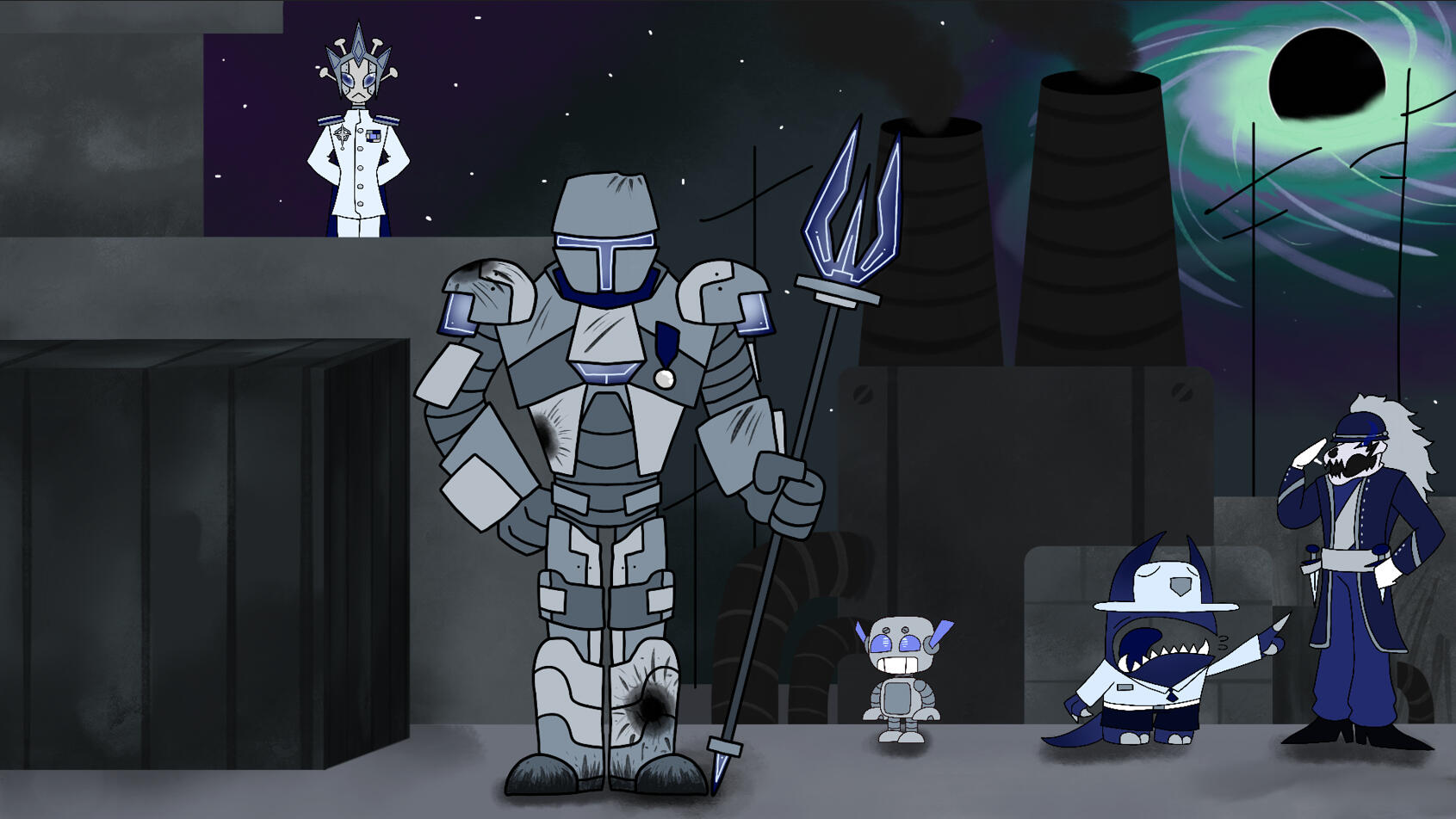
Finally, we landed on a space aesthetic. The story follows the Space Navy and Space Pirates, who are trying to harness energy from the rift to turn into ore, which in turn powers their ships. The goal as the player is to use your diverse cast of pieces (both in design and in mechanics) to obtain the other teams ore piece.For the character designs, I took inspiration from many forms of cartoony media. I wanted the characters personality, looks, and weapons to reflect their move sets within the game. Pallets were chosen for both teams, and I strictly followed these pallets to make the characters feel they belong to their respective teams.For all background work, I used water color and paint brush tools within Autodesk Sketchbook to create works that are not too distracting from the main focus of the game: the characters.For the Raid on Rift logo, I wanted it to be simple and easy to recognize. We ended up with multiple different variations of the logo, so creating the rift icon to help tie them all together helped immensely.18 unique designs across two teams, multiple pieces of background art, multiple variants of the Raid on Rift logo, and much more. Want to check it out for yourself? Raid on Rift is FREE on Steam!


Let's move to the talking stage...
(Sorry, did I come on too strong?)

Can't get enough of Bee?
I'm flattered, really. Feel free to stalk me across my many socials, where you can also find more of my work and shenanigans.